My Unpublished 2002 Article for Comic Book Artist
December 9, 2025
Introduction. Back in the year 2000, when Mark’s Very Large National Lampoon Site was only three years old, I got an email from Jon Cooke, editor of Comic Book Artist. He was planning to do an entire issue devoted to the comics of National Lampoon, planned for early 2001. He was looking for contacts of National Lampoon contributors and hoped I might be able to help. I did have a few, which (with permission) I shared with Jon. But the person he was most interested in interviewing was Michael Gross, NatLamp’s art director from 1970-75, the era he wanted to focus on of the special issue. Since that happened to be the focus of my site, he asked me to be a consultant on the issue.
After exchanging some emails back and forth that year, the project seemed to be stalled, mainly due to our inability to contact Michael. But then in 2002, out of the blue, I got an email from Michael, expressing his admiration for my website. He was alive and well, retired from magazines and Hollywood, and running an art gallery in California.
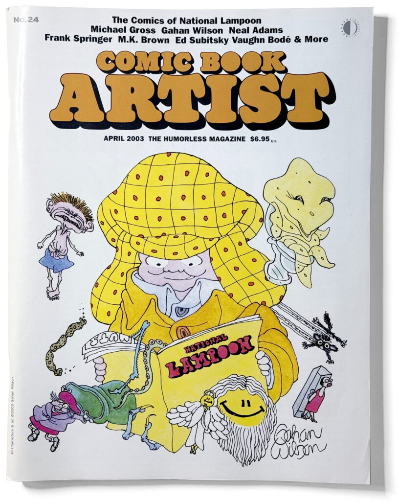
And so, the special issue of Comic Book Artist, The Comics of National Lampoon, was finally published in early 2003, with Gahan Wilson himself doing the cover illustration. It featured interviews with Michael Gross, Gahan Wilson, Alan Kupperberg, Neal Adams, Frank Springer, M.K. Brown, Ed Subitzky, and Mark Bodē (son of the late Vaughan Bodē). (I also did the National Lampoon-style logo treatment for the cover, and provided high-quality scans of covers and other stuff for the issue.)
Jon invited me to write a short piece about the design of National Lampoon, but, like a lot of stuff planned for the issue—including interviews with B.K. Taylor, Shary Flenniken, Sean Kelly, and Michael Choquette—it didn’t make the cut. It’s probably just as well, since it overlapped quite a bit with Jon’s own introduction.
I was recently reminded about all this by a post on Instagram by Dummy magazine, and so I thought, why not publish the article on my site? And so, without further ado, here is my piece, written in 2002, lightly edited:
The Design and Art Direction of National Lampoon
My first exposure to National Lampoon was in the magazine rack at K-mart.: The Best of National Lampoon No. 1, the one with Rick Meyerowitz’ Mona Gorilla on the cover. I could tell it was some kind of humor magazine, but it was in the same part of the rack as Playboy. Adult stuff. At the age of fifteen, I didn’t feel comfortable flipping through adult magazines in K-mart. But it caught my attention. A year later I was a subscriber.
———
I had been an avid Mad reader since the age of 10. My parents gave me a copy of The Ninth Annual Worst From Mad (with the bonus 33-1/3 recording of “It’s A Gas”) for baby-sitting my younger siblings for the first time.
In those pre-teen years, Mad was my window into the world of adults. I couldn’t go see the X-rated A Clockwork Orange, but I could read the parody in Mad. Although Mad tackled adult topics, they were careful to keep it PG, no doubt aware that a large portion of their readers was in the pre-teen set.
Mad was also my introduction to subversive humor. They poked fun at the foibles and flaws of modern society, but they did so in a very self-conscious, self-deprecating way, as if to say, “look how stupid people are, but we’re just a bunch of idiots—what do we know?” which had a buffering effect.
Mad had a distinct format that went back to its beginnings as a comic book. Everything was framed as a “Mad Look at…” or “Mad Goes to…” or “Scenes We’d Like to See” or whatever. There was usually an introduction to anything more than a page long, to make sure the reader knew what the joke was going to be about. There were little idiosyncrasies, such as the unnaturally frequent use of the word “mainly” or the seeming editorial requirement of using an exclamation point at the end of every sentence.
There was something purposely silly about the Mad approach to humor. It wasn’t enough to simply do a parody of a movie or a TV show or a magazine. Everything had to look funny, with every corner filled with gags—not necessarily related to the larger article. Use black and white cartoons instead of color photos for a magazine parody? It didn’t matter, as long as it was funny. And it was funny. But you would never mistake a Mad parody for the real thing.
National Lampoon was very different. Where Mad’s heritage was derived from comic books, National Lampoon was the child of glossy magazines and college humor, by way of the Harvard Lampoon. The self-deprecating attitude of Mad (which always referred to itself as worthless trash) was replaced with mock-grandeur (for example, the elaborate architectural plans for the 1000-story National Lampoon Building). It was sophisticated in a way that made you feel smart and hip. No topic was out-of-bounds and there was a shocking, adult frankness that made Mad look like kid’s stuff.
In National Lampoon, a hard line was drawn between parodies and everything else. Parodies were made as faithful as possible to the object of the parody, down to the paper stock and even the format in some cases (they did a pull-out full-size newspaper page printed on newsprint, for example). Every little detail was painstakingly captured, and, if possible, enlisted in aid of the larger point of the parody. If not, it was left as is to ensure that the effect was complete. All of this realism and mimicry made their parodies even more subversive. It was like peering into twisted but hilarious alternate reality.
The non-parody articles were presented in a straightforward way not unlike a general interest magazine with clean layouts that let the author or artist take center stage. By framing these other articles in such a simple, consistent way, you could always tell what was a parody and what was not. There were no introductions, no explanations. When it was a parody, the magazine transformed itself into something else. When it wasn’t a parody, it just looked like National Lampoon.
This approach was so skillfully handled that they could even run parodies of Mad magazine or National Lampoon itself.
The talents behind this were art director Michael Gross and design director David Kaestle who were at the magazine for most the early ’70s. It seemed there was no visual style they couldn’t ape.
This distinction between parodies and non-parodies was true with its use of comics as well.
In National Lampoon, a parody of a comic book would look exactly like the real thing—until you started reading it. Every last detail—including the black and white ad on the inside front cover of the comic—would be meticulously recreated. Not only were they able to get artists to imitate these styles, they often used top comic book artists such as Neal Adams, Bernie Wrightson, Walter Simonson, Alan Kupperberg, Joe Orlando, Frank Frazetta, Francis Holleridge, Frank Springer, etc.
A good example of the difference in approach to comics between Mad and National Lampoon is the way each handled a parody of Tarzan. Tarzan was often parodied at Mad. A typical example would be a “Scenes We’d Like to See” piece where Tarzan gives his Tarzan yell, swings from tree to tree, and finally arrives at a tree-top outhouse where the yell becomes a sigh of relief. The style is cartoony and broad and is simply a gag based on Tarzan’s well-known characteristics.
National Lampoon took a subtler approach. In Michael O’Donoghue’s Tarzan of the Cows, drawn by Frank Springer, it looks exactly like a vintage Tarzan comic book, except the premise has been changed. Instead of his parents’ plane crashing in the jungles of Africa, it crashes on a farm in Wisconsin. And instead of being raised by apes, the infant boy is raised by cows. Other than that, it looks and reads just like a real, vintage Tarzan comic, except it’s achingly funny. The Mad piece was a simple gag about a well-known and popular character. The National Lampoon piece was about the whole idea of Tarzan.
The comic book form was frequently used as a satirical tool in the Lampoon. An appropriate genre would be chosen and re-cast as needed. So you get superhero comics like Deadman (a crime-fighting corpse), Verman (becomes a louse or other pest when touching his lips to garbage), Son-o-God (Christ as a superhero), Utopia Four (intellectuals out to save the world); romance comics like White House Romance, Boys’ Romance Comics, Doug Kenney’s First Lay and First High Comics; war comics like Defeat Comics, horror comics like Dragula, and Tales of the South; “classics” comics featuring Siddhartha, and science fiction comics like Weerd Tayls (written by cockroaches in the distant future). Practically every genre was used at one time or another, even underground comics. Eventually, National Lampoon devoted an entire special issue (National Lampoon/The Very Large Book of Comical Funnies, 1975) parodying dozens of comic genres covering the entire history of the form, from Krazy Kat to Zap.
Like the non-parody articles, National Lampoon’s non-parody comics were handled more straightforwardly. Early in his tenure as art director, Michael Gross created the Funny Pages section, filled with comics that ran anywhere from a quarter to a full page. The Funny Pages became one of the most popular and enduring parts of the magazine with such regulars as Nuts by Gahan Wilson, Dirty Duck by Bobby London, Trots and Bonnie by Shary Flenniken, Chicken Gutz by Randall Enos, Cheech Wizard by Vaughan Bodē, Politessman by Ron Barrett, Idyl by Jeff Jones, The Appletons and Timberland Tales by B.K. Taylor, Mule’s Diner by Stan Mack, One Year Affair by Ralph Reiss and Byron Priess, Shab by B. Kliban, several long running series by Charles Rodrigues, including The Aesop Twins, and an endless series of “meta” comics by Ed Subitsky. Later on, the Funny Pages section was home to Zippy the Pinhead by Bill Griffith and strips by Dan Clowes, Mark Marek, Drew Friedman, and Rick Geary.
———
Ultimately, National Lampoon had a bigger influence on me than Mad. I’m not sure if it was because of the magazine itself or because it appeared when I was coming of age. Reading it gave me a healthy ability to not take anything completely seriously. It also gave me an eye for visual design that has helped me professionally as a commercial artist.
When I read Mad, I wanted to be a cartoonist. But when I read National Lampoon, I decided to become a magazine art director instead.
Postscript
While my piece got cut, Jon did generously give me a full page—on the inside front cover, no less—to promote my website in lieu of payment for my help with the issue (which, to be honest, was nothing compared to the work Jon put into it). Here is the ad I made:
Comments
VERY nicely done, Mark!
—Dave Meredith
December 11, 2025 10:57 am
A nice, informative article from someone who grew up with National Lampoon, unlike me who was only a kid when the mag folded and only knew about some of the films/Chevy Chase. Shame it got cut. I recently picked up a copy of Comic Book Artist #24. Did Jon Cooke ever publish the cut interviews with B.K. Taylor, Shary Flenniken, Sean Kelly, and Michael Choquette anywhere? Issue 24 said they were going to publish them in a revamped issue of Comic Book Artist or in a full-fledged book.
—Michael Rookard
February 19, 2026 8:04 pm
Thanks! After I posted this back in December, I heard from Jon and he said his unpublished Shary Flenniken interview from back then would be published in an upcoming issue of Comic Book Creator.
—Mark
February 19, 2026 8:11 pm
Thanks! In issues 42/43. I'll probably pick those up.
—Michael Rookard
February 20, 2026 6:59 am
Original material (excluding quoted material) © 1997-2026 Mark Simonson.
Mark's Very Large National Lampoon Site is not affiliated with National Lampoon or National Lampoon Inc.
Click here for the real thing.
Leave a Reply